Hello Design Lovers! 

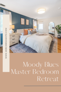
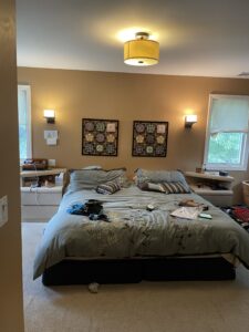
This project was a long time coming but wow! I’m so happy with the way it came out. But more importantly, my clients are thrilled with the end result. Let me give you a little run down on this project came to be. My clients, Hillary and Josh, were in desperate need to get their master bedroom updated. They no longer felt their room was a sanctuary for them, a place where they can come to unwind, relax, and ultimately sleep (of course).
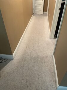
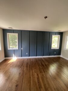
The biggest eye sore though probably had to be the carpet. They wanted to rip up the carpet and have hardwood floors throughout. They knew there was hardwood under the carpet in the hallway of their master bedroom, but they didn’t know if the main bedroom space had hardwood since that part of the house was an addition. Sure enough, there was only hardwood flooring in the hallway. I brought in a contractor to add hardwood in the rest of the space, making the transition as seamless as possible.

Hillary wanted to do some sort of accent wall, but she wasn’t really sure what exactly she wanted. She had shown me several photos of inspiration on Pinterest and then I began to work out some ideas. We had spoken about possibly putting up wallpaper, but she really wanted some dimension.
It was a bit challenging to come up with a design since there are two windows on that wall which would ultimately break up the flow, but after some planning, it worked out perfectly! The windows don’t seem like such a big deal anymore.
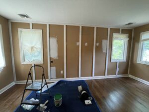
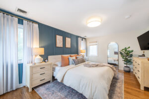
Once the accent wall was complete, it was time to paint. We said goodbye to the outdated gold/taupe color and freshened up the space with updated colors. We went with Benjamin Moore Thousand Oceans for the accent wall and the rest of the space is Benjamin Moore November Rain. Paint makes a HUGE difference and just like that, the room was ready to be decorated!
I wanted to go with a neutral bed frame to allow the accent wall to stand out. The contrast between the white headboard and the blue wall is exactly what I was going for! We went with off-white drapery for the two back windows, making sure not to take away from the accent wall.
The windows on the side walls were a bit challenging since they are so close to the windows on the accent wall. I didn’t want to add more drapery to those side windows which I felt would take away from the showstopper of a wall, so we opted for beautiful simple roman shades. Plus, my clients informed me they needed privacy from the neighbors, so roman shades did the trick!
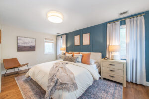
We incorporated light wood tones for the nightstands and dresser which really makes the room feel airy and spacious. Had I selected dark wood tones, the room would’ve felt a lot smaller and closed in.
I brought in some color with the beautiful vintage inspired area rug (the touches of blue compliments the accent wall really well). I wanted to bring in some more color without it overpowering the space. The neutral duvet allowed for us to play with color for the rest of the bedding and that’s exactly what we did with the throw pillows. There’s just enough color without it all feeling too overpowering.
My clients and I are so happy with the way this room came out! Such a major transformation…it’s like night and day. Now onto the next project. Stay tuned for more!