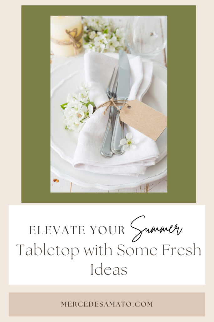
Hello Design Lovers! 

Happy June! I can’t believe we are just about halfway through the year- it’s so crazy to think about. The warm weather is upon us in New Jersey and I couldn’t be more excited. I’m looking forward to having a fun-filled summer spending time with my friends and family!
For those of you who will be hosting barbecues and parties in your yard (or dinner parties inside), I wanted to give you some tabletop inspiration that your friends and family will love.These are some fun ways to spruce up your table settings from average paper cups and plates to something a little more thoughtful and pretty.
If you don’t want to feel like you’re going way over the top, create a beautiful centerpiece that will be the perfect focal point for your table. This can be as simple as going to the grocery store or farmer’s market to get fresh flowers, putting them on a decorative tray and adding a few candles. Maybe even consider buying a bouquet, taking a few mason jars (around three should work) and then spreading them out on the table or grouping them close together. Adding a runner will bring the simple decor together.
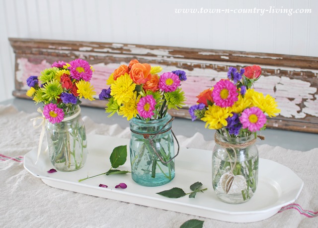 Source: Town N Country Living
A great way to move away from using tacky paper plates and cups, is to buy cheap glassware at the dollar store or even Walmart. If you don’t want to do dishes or throw them in the dishwasher, then consider a more elegant type of disposable plates: gold rimmed plastic ones complete with gold rimmed cups, matching utensils, and napkins. This gold set on Amazon comes out to just under $40!
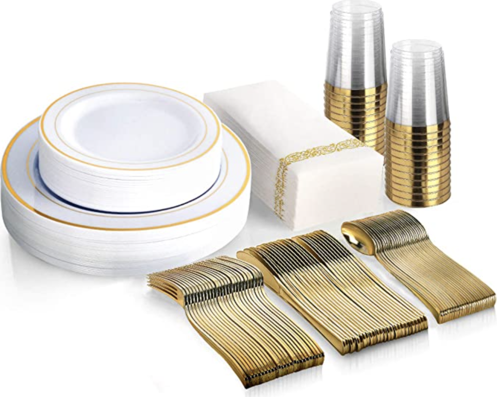 Source: Amazon
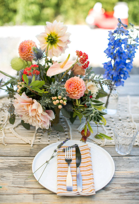
If you don’t want to use the napkins that come with a set like the one I linked from Amazon, you can easily replace them with some beautiful printed napkins at each place setting and then finish it off with a little bit of greenery (it could just be a stem or two, nothing too fancy).
 Source: 100 Layer Cakelet
Let’s say you’re looking to create a fancier table setting complete with multiple plates and chargers maybe for those dinner parties. Here’s how to do it. First, pick your favorite charger. I’m loving this woven madras one from World Market.
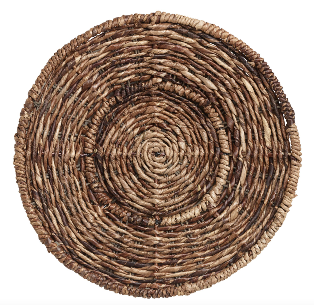 Source: World Market
This charger from Pottery Barn comes in either Antique Gold (pictured below) or Bronze if you wanted to go with a metal look.
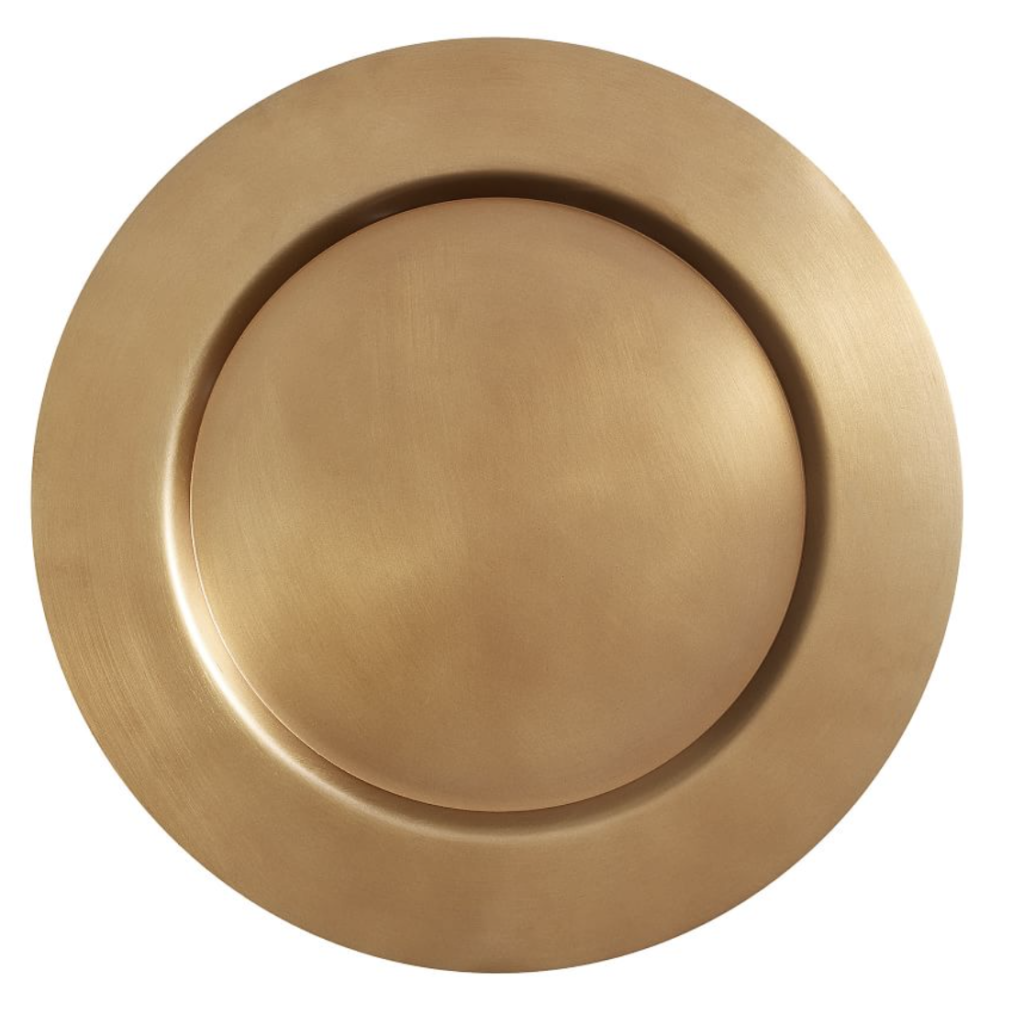 Source: Pottery Barn
Next, you’re going to want to have your dinner plate and then on top of that, your salad plate. You might consider just using one plate (this is all up to you and how you will be hosting your guests). Personally, I’m loving these dinner plates from West Elm.
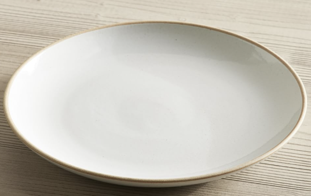 Source: West Elm
On top of your salad plate, find some pretty napkins that you like and fold them nicely or wrap them in a cone shop and tie them with some string or use a napkin ring. As I mentioned earlier, if you want to add a finishing touch, cut a stem of greenery.
Your dinner fork is immediately on the left of the plates and then to the left of that, is your salad fork. To the right of your plates, is your dinner knife, then to the right of that is your teaspoon then soup spoon. This really all depends on how formal you want your dinner party or barbecue to be. Personally, I wouldn’t go too far with including a teaspoon. Make sure to include a water glass and a wine glass located on the top right of the plates.
Here’s a helpful image to compare between a formal and an informal place setting.
 Source: Today’s Creative Life
Let’s move on to your drink table, appetizer table, and/or dessert table. Don’t forget to incorporate whatever theme you have going on for your main table(s). Let’s say you’re going with a gold theme. Add subtle hints of gold on these additional tables so the look feels all cohesive and not random. This can be done with gold vases where you have some greenery or flowers, the tablecloth or runner, candle holders, etc.
These additional tables are the perfect way to get a little creative and do a little something extra! For example, a fun way to have your guests grab their utensils is by using some terracotta planters and grab some chalk. Little DIY touches like this really goes a long way!
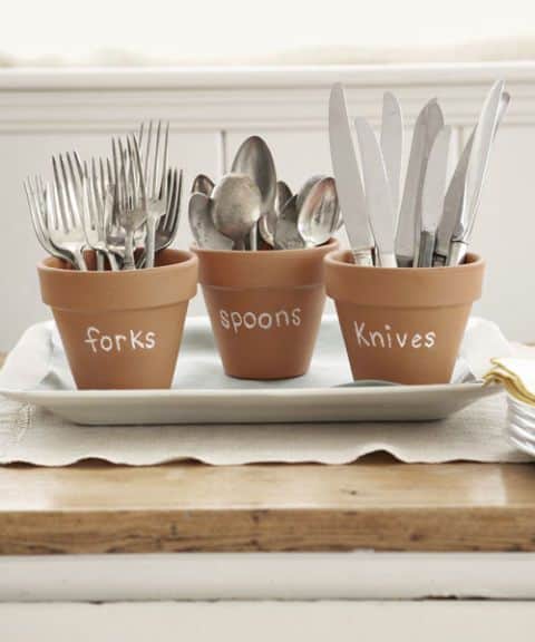 Source: The Mummy Front
If you’re anything like me and you love a good fire pit moment, how fun would it be to create a s’mores bar?! Instead of just leaving the chocolate, graham crackers, marshmallows and sticks in their original packaging, grab a tray, some mason jars and bowls. This will definitely add a little something extra and creates a nicer look!
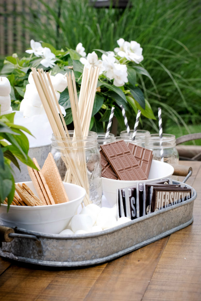 Source: How to Simplify
I could go on and on about ways to decorate your tables this summer but I feel like it would be the longest blog post so I think I’ll stop here. I hope you all have an amazing summer and as always, I hope this post was helpful as you begin thinking about hosting your loved ones whether it be a small barbecue in the yard or a more formal dinner party.