• Skip to primary navigation
  • Skip to main content
  • Skip to primary sidebar
(717) 383-9380
Call Us: (717) 383-9380 | Email Us: info@outgo360.com
Main logo Mercedes Amato
  • Home
  • INTERIOR DESIGN
    • Interior Decorating
    • CONSTRUCTION & REMODEL
    • E-DESIGN
  • HOME STAGING
    • THE PREP WORK
    • Occupied Staging
    • Vacant Staging
    • Accessory Rentals
  • REAL ESTATE
  • Main logo Mercedes Amato
  • ABOUT
  • PORTFOLIO
  • BLOG
  • CONTACT
  • Show Search
Hide Search

DESIGN LOVERS UNITED: A BLOG

how-to-maximize-space

How to Maximize Space in a Small Room

Mercedes Amato · January 29, 2021 · Leave a Comment

Hello Design Lovers! Happy Friday 🤗

It seems like I’ve been on lots of consultations lately where homeowners want to make the most out of their small living spaces without building an addition. Well, I’m here to tell you it’s possible with a few tips and tricks. These are the kinds of things that will make it seem like your small space is actually BIGGER than what it really is.

The common misconception is that small rooms can’t sell homes or they just aren’t functional enough to meet a family’s needs. Whether you are staging your home to sell or redecorating for the long run, you want to make the most out of your small space. Follow these simple solutions to maximize the potential in any small room!

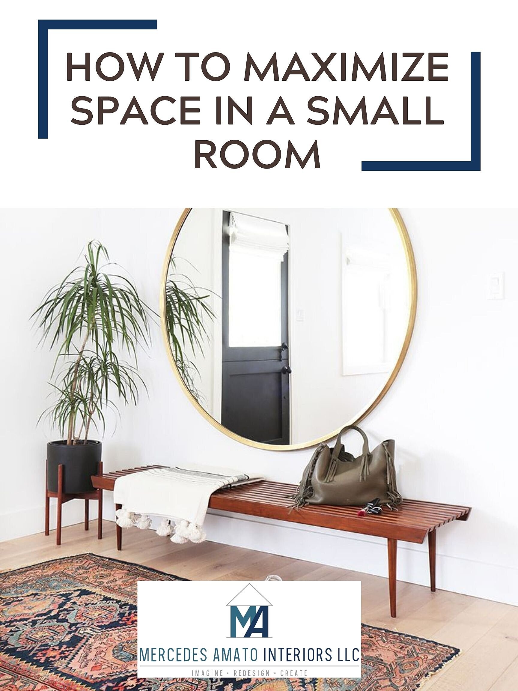
USE MIRRORS TO REFLECT LIGHT

Mirrors will be your best friend when it comes to making a room feel brighter and more spacious.

DO

Position a mirror on the wall perpendicular to windows and or directly across from a window

DON'T

Hang a mirror directly across from a blank wall (This will simply reflect a boring empty space).

Credit: Amber Interiors
CREATE THE ILLUSION OF HIGHER CEILINGS WITH WINDOW TREATMENTS

The higher you hang curtains, the larger the room will feel. Hanging curtains 5-7 inches above the window casing will draw your eye up towards the ceiling as opposed to 3 inches above the window casing.

DO

Use light sheer curtains allowing the most light into the room

DON'T

Use heavy, printed curtains that block light

Credit: www.livelovediy.com
USE MULTI-FUNCTIONAL PIECES

My clients tend to forget that in a living room, you don’t just have to use a coffee table in front of the sofa. Ottomans can act as a coffee table and can even provide additional seating! Don’t simply choose an ottoman for design purposes; there are plenty of ottomans that act as storage units to de-clutter a small living room.

Check out this cool storage ottoman from West Elm!

Credit: West Elm
CHOOSE WALL LIGHTING (IF IT MAKES SENSE)

Floor lamps and table lamps can take up precious space in a tiny room. Consider sconces or chandeliers to brighten a space and even incorporate wall art to spruce it up!

Credit: Mix and Match Design
DECLUTTER YOUR SHELVES!

If you are staging your home, the last thing buyers want to see are shelves with a ton of knick-knacks in a tiny room. Organize books by color (only a few) while leaving some upright and stacking others. Put decorative objects in between such as small plants, modern vases, decorative art, and plates. These tips can also apply if you’re simply decorating your home, of course.

Consider painting the walls white to create an airy feel while making the room appear larger.

Credit: Amy Sklar Design

Now I know to some of you, those tips and tricks were no “secret”. But I’m just here to refresh your memory on how to make the most out of your small space because yes, they seem pretty obvious, I just needed to give you that nudge. I hope this post inspired you to tackle your home and get those creative juices flowing! Happy decorating!

Interior Designer

Reader Interactions

Leave a Reply Cancel reply

You must be logged in to post a comment.

Primary Sidebar

Blog
Recent Posts

5 Tips on Mastering the Art of Mixing Textures

Mercedes Amato | April 1, 2023 Leave a Comment

Hello Design Lovers! 🏡💕

Mixing textures in interior design can add warmth and depth to a space, making it feel more inviting and visually interesting. The way different textures are combined can make or break the overall aesthetic. By combining different textures, you can create a multi-layered and visually appealing space that reflects your unique style. Here are some tips on how to mix textures effectively in your home:

1. Start with a neutral base: To mix textures effectively, it's best to start with a neutral base. This creates a cohesive foundation for the different textures that you will add to the space. A neutral base could be a neutral wall color, such as white or beige, or a neutral-colored sofa or bed frame. Starting with a neutral base allows you to experiment with different textures and colors without overwhelming the space.

Source: @beauxarts107

2. Mix materials: Experiment with mixing different materials to add interest and variety to a room. You could mix materials such as wood, metal, leather, and fabrics. For example, a leather sofa paired with a chunky knit throw, or a metal coffee table with a soft, shaggy rug. Mixing materials will create contrast and add depth to the space.

Source: Crate & Barrel

3. Vary texture scale: Varying the scale of textures in a room is an important aspect of mixing textures in interior design. To do this, you can mix large and small textures together. For example, a large, nubby rug paired with a delicate, sheer curtain. Or, a smooth, glossy side table next to a chunky knit blanket. Varying texture scale will create visual interest and add depth to the space.

Source: Crazy Wonderful

4. Mix patterns: Mixing patterns is another way to add texture to a space. To do this effectively, it's important to balance the patterns so they don't clash with each other. You could mix a bold, geometric print with a subtle, organic pattern. Or, a small-scale pattern with a large-scale pattern. Mixing patterns will create a dynamic and visually interesting space.

Source: Amber Interiors

5. Layer textures: Layering textures is a great way to add depth and interest to a space. You could layer a faux fur rug over a jute rug, or layer a velvet throw pillow on top of a linen sofa. Layering textures creates a multi-dimensional look that adds visual interest to the space.

Source: Studio McGee

Mixing textures in interior design is a great way to add depth, interest, and personality to a space. By experimenting with different materials, textures, and patterns, you can create a visually dynamic and inviting environment. Remember to start with a neutral base, vary texture scale, mix patterns carefully, layer textures, and most importantly, trust your instincts and have fun! Mixing textures is an opportunity to express your unique style and create a space that feels like home.

How To Create a Functional Kitchen Using The Working Triangle

Mercedes Amato | March 1, 2023 Leave a Comment

Hello Design Lovers! 🏡💕

Let's talk about the functionality of a kitchen. The working triangle in a kitchen refers to the layout of the three main elements in a kitchen: the refrigerator, the sink, and the stove or cooktop. The ideal layout is one in which these three elements are arranged in a triangular shape, with the refrigerator, sink, and stove positioned at the three corners of the triangle. This design allows for easy movement and efficient use of space, making it a popular layout for kitchen designers and architects.


The dimensions between a working triangle in a kitchen can vary depending on the size and layout of the kitchen, as well as the personal preferences of the homeowner. However, a commonly recommended guideline is to have no side of the triangle longer than 9 feet or shorter than 4 feet. This allows for easy movement and efficient use of space while still allowing enough room for other kitchen features such as countertops, cabinets, and an island. Additionally, the sum of the three sides of the triangle should be between 13 and 26 feet. These guidelines ensure that the kitchen is functional and efficient.

Source: Wikipedia

Here are some examples of common kitchen layouts:

U-Shaped Kitchen: This layout consists of cabinets and appliances lining three walls, forming a U-shape. This layout provides ample counter space and storage, making it ideal for larger kitchens.

Source: Moroso Construction

L-Shaped Kitchen: This layout consists of cabinets and appliances lining two adjacent walls, forming an L-shape. This layout is versatile and can be adapted to a variety of kitchen sizes and styles.

Source: DeVOL Kitchens

Galley Kitchen: This layout consists of two parallel walls with cabinets and appliances lining both sides. This layout is ideal for smaller kitchens as it maximizes the use of available space.

Source: Kismet House

Island Kitchen: This layout includes a central island that provides additional counter space and storage. This layout is ideal for larger kitchens with ample floor space.

Source: Amber Interiors

Peninsula Kitchen: This layout includes a connected island that is attached to one wall, providing additional counter space and storage. This layout is ideal for smaller kitchens that require additional workspace and storage.

Source: Madison Nicole Design

When it comes to designing a kitchen with the working triangle in mind, there are a few key things to keep in mind. First, you want to make sure that the three main elements - the refrigerator, sink, and stove - are arranged in a triangular shape. This allows for easy movement and access between the three areas.

Now that you know the importance of the working triangle, I'm sure the next time you're scrolling on Instagram or Pinterest, you'll be more mindful on the proper kitchen design layout. You might even be able to notice the different styles of kitchen designs!

Moody Blues Master Bedroom Retreat

Mercedes Amato | February 1, 2023 Leave a Comment

Hello Design Lovers! 🏡💕

This project was a long time coming but wow! I'm so happy with the way it came out. But more importantly, my clients are thrilled with the end result. Let me give you a little run down on this project came to be. My clients, Hillary and Josh, were in desperate need to get their master bedroom updated. They no longer felt their room was a sanctuary for them, a place where they can come to unwind, relax, and ultimately sleep (of course).


The biggest eye sore though probably had to be the carpet. They wanted to rip up the carpet and have hardwood floors throughout. They knew there was hardwood under the carpet in the hallway of their master bedroom, but they didn't know if the main bedroom space had hardwood since that part of the house was an addition. Sure enough, there was only hardwood flooring in the hallway. I brought in a contractor to add hardwood in the rest of the space, making the transition as seamless as possible.


Hillary wanted to do some sort of accent wall, but she wasn’t really sure what exactly she wanted. She had shown me several photos of inspiration on Pinterest and then I began to work out some ideas. We had spoken about possibly putting up wallpaper, but she really wanted some dimension.


It was a bit challenging to come up with a design since there are two windows on that wall which would ultimately break up the flow, but after some planning, it worked out perfectly! The windows don’t seem like such a big deal anymore.


Once the accent wall was complete, it was time to paint. We said goodbye to the outdated gold/taupe color and freshened up the space with updated colors. We went with Benjamin Moore Thousand Oceans for the accent wall and the rest of the space is Benjamin Moore November Rain. Paint makes a HUGE difference and just like that, the room was ready to be decorated!

I wanted to go with a neutral bed frame to allow the accent wall to stand out. The contrast between the white headboard and the blue wall is exactly what I was going for! We went with off-white drapery for the two back windows, making sure not to take away from the accent wall.

The windows on the side walls were a bit challenging since they are so close to the windows on the accent wall. I didn't want to add more drapery to those side windows which I felt would take away from the showstopper of a wall, so we opted for beautiful simple roman shades. Plus, my clients informed me they needed privacy from the neighbors, so roman shades did the trick!

We incorporated light wood tones for the nightstands and dresser which really makes the room feel airy and spacious. Had I selected dark wood tones, the room would've felt a lot smaller and closed in.

I brought in some color with the beautiful vintage inspired area rug (the touches of blue compliments the accent wall really well). I wanted to bring in some more color without it overpowering the space. The neutral duvet allowed for us to play with color for the rest of the bedding and that's exactly what we did with the throw pillows. There's just enough color without it all feeling too overpowering.


My clients and I are so happy with the way this room came out! Such a major transformation...it's like night and day. Now onto the next project. Stay tuned for more!

  • 2023 Interior Design Resolutions
  • Tips and Tricks When Designing Your Home Office
  • 6 Tasteful Ways to Decorate Your Home for Halloween
Alt logo
Business Hours
MONDAY - FRIDAY
9 am - 5 pm
SATURDAY
By Appointment Only
SUNDAY
Closed
Contact Details
CALL US TODAY
201-663-3713
EMAIL US AT
info@mercedesamatointeriors.com
â’¸ - MERCEDES AMATO | ALL RIGHTS RESERVED | PRIVACY POLICY